An MNC marketing head briefs three studios for the same 60-second product launch film. Three weeks later, the proposals come back. The first studio sends back a painterly cinematic with slow camera moves and a soft, atmospheric palette. The second and third studios both lean styled. One proposes a cel-shaded explainer with TikTok cut-downs already laid out beside the hero film. The other pitches a flat 3D walkthrough that looks like an extension of the product UI. All three are competent. The marketing head has to choose one before anything moves forward.
Style choice in 3D animation is a brand-positioning decision dressed as a production decision. Most briefs treat it the other way around. The team picks the style based on a recent reference they liked, books the studio, then discovers six weeks later that the style is sending a brand signal the campaign was not meant to send. The fix is to start with the signal, then choose the style that delivers it.
What each style actually signals to your audience
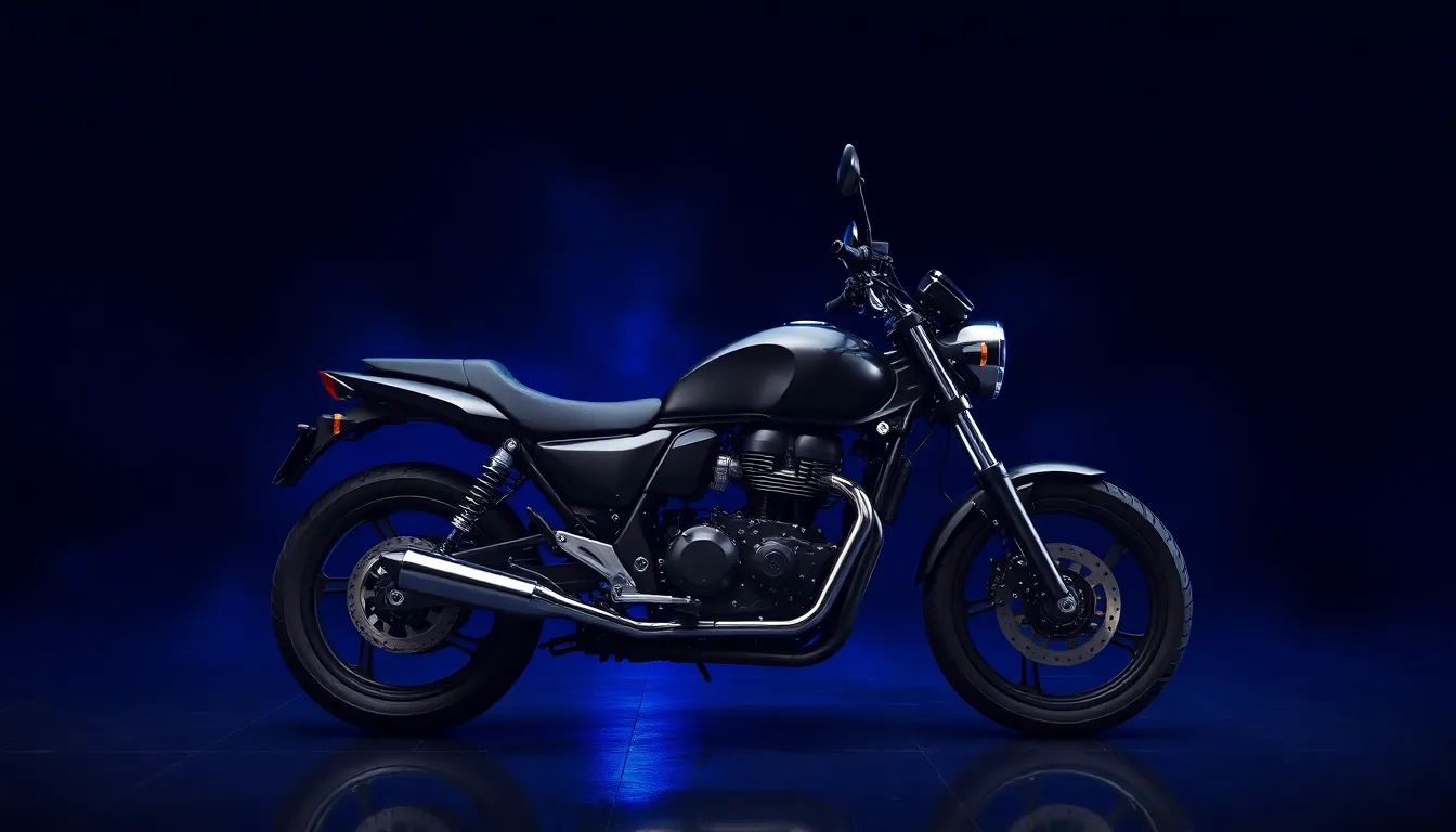
Painterly 3D signals premium and considered. The brush-like textures and soft blended lighting read to the audience as a brand that put time into the work. For a luxury client launching a heritage product or a tourism campaign for a destination that competes on atmosphere, painterly is the right register. The signal is craft.
Cel-shading signals confident and accessible. The sharp shadow bands and high-contrast palette read as content-forward, not corporate. The style works for explainers, gaming, OTT, and educational pieces where the audience needs to follow a story quickly. The signal is clarity with personality.
Flat 3D signals modern and efficient. Solid colours and geometric forms with minimal gradient shading. The style reads as a brand that respects the audience time. For SaaS and fintech communication where the product is the protagonist, flat 3D matches the product itself. The signal is precision.
This choice is a positioning call. The right question to ask is which adjective the audience should walk away thinking.
When painterly 3D earns its place
Painterly works when the brand can afford the time and the message needs atmosphere over information. A heritage luxury watchmaker launching an anniversary collection. A national tourism board producing a film about the country at golden hour. A pharmaceutical brand telling a patient-story film that needs emotional weight without sentimentality.
These campaigns share a common shape. The brand is selling feeling, not features. The audience is being asked to associate the brand with a specific emotional register, and there is enough time in the schedule to produce work where every frame is essentially a painting.
For a global luxury fashion campaign targeting the year-end gift market, painterly 3D on a 90-second hero film gives the brand a visual identity that distinguishes it from the polished CGI standard of the category. The film does not need to teach anything. It needs to feel like the brand.
When cel-shading is the safest choice
Cel-shading is the workhorse of stylised 3D for any MNC that needs to communicate something specific to a broad audience across multiple formats. The clean lighting and sharp contrast read well on mobile, which matters for any campaign that lands primarily on short-form mobile video like TikTok or Instagram Reels.
A B2B software company explaining a new compliance workflow to channel partners, or a medical device brand teaching surgeons how to use a new instrument. The shared problem in these briefs is that the audience needs to understand a process. Cel-shading shows the process clearly without making it feel like an instruction manual.
The signal sent by cel-shading is that the brand is confident enough in its content to present it in an approachable visual register. Corporate films often default to photorealism because it feels safer. Cel-shading takes a slight stylistic risk and rewards it with stronger audience attention.
When flat 3D is the only right answer
Flat 3D belongs to a specific category of campaign. SaaS product walkthroughs and fintech onboarding explainers where the product UI is itself a visual asset, and the animation should feel like an extension of it.
For a fintech brand launching a new investing feature, a flat 3D explainer can use the product own colour palette and repeat the product own geometric shapes. The audience cannot tell where the product ends and the marketing begins, which is the goal.
Flat 3D fails when used outside this category. A luxury brand using flat 3D reads as cheap. A heritage brand using flat 3D reads as anachronistic. The style is right when the brand is itself modern and minimal. The style is wrong when the brand is selling anything else.
How to decide when one campaign needs more than one style
Some MNC campaigns are genuinely cross-format and one style cannot do all the work. A product launch with a 90-second hero film, a 30-second TVC cut-down, a 15-second Reels version, a 6-second pre-roll, and an explainer for the sales team has different requirements at each surface.
The right approach is to pick a primary style for the hero asset and use it as the visual anchor. The shorter cuts can shift register slightly, often to cel-shading or flat 3D for clarity, while the hero film keeps the painterly cinematic. The brand identity stays consistent because the hero asset is the one the audience associates with the campaign. The shorter cuts are functional, not aspirational.
Where MNCs go wrong is treating every cut as equally important and trying to keep one style across all of them. The result is either a painterly Reels cut that fails because the medium is too short, or a flat 3D hero film that fails because the brand needed more atmosphere.
The mistake MNCs make when picking a style
The most common picking method is reference-driven. The marketing team saw an animation last week that they liked. They send it to the studio and ask for something similar. The reference is almost always a painterly cinematic from a luxury brand, even if the new brief is for a fintech product. The style choice has been made before the brief was discussed.
The second most common method is internal-preference-driven. A CMO has personal taste. The CMO likes painterly. The campaign goes painterly regardless of audience or schedule. The style choice has been made before the audience was considered.
The right method starts from the audience and the campaign objective. Who is watching, and what does the brand want them to feel afterward. The style sends a signal that should match the answer to those questions. The reference comes last, as a way to communicate the chosen direction to the studio. Not as the source of the choice.
The animation style is the brand voice for the campaign. A painterly film tells the audience that the brand has time and taste. A cel-shaded or flat 3D film delivers a different kind of signal entirely, one of confident clarity rather than considered atmosphere. The audience reads the style before they read the message, which means the style needs to align with the message before any production begins.
Dustin Hill Productions plans 3D animation projects around the signal the brand is trying to send. The style follows from the audience and the objective, not from the reference deck or the schedule. For animation services where the visual register has to do as much work as the message it carries, the choice of style is the first creative decision worth making with care. For more on the underlying craft, see how stylised 3D animation builds emotional realism.