Scroll a marketing feed for ten minutes and most of the animation looks the same, vector shapes snapping into place, product renders lit like a showroom floor. Then a line wobbles off true as it draws itself across the screen, and the thumb stops scrolling.
That pause is a reaction to something specific. A hand-drawn line reads as something a person made, and that registers as attention in a feed built mostly from software. The same style on the wrong brief reads as cheap instead of crafted, and the difference has little to do with how rough the line looks. What follows is where hand-drawn belongs, and where it does not.
The short version: hand-drawn animation earns its place when the roughness follows visible rules instead of chance. It suits onboarding and culture work, and any topic that needs to read as human before exact. It works against precision claims and photoreal product proof, where the audience checks exactness rather than character.
What hand-drawn animation actually means on a corporate project
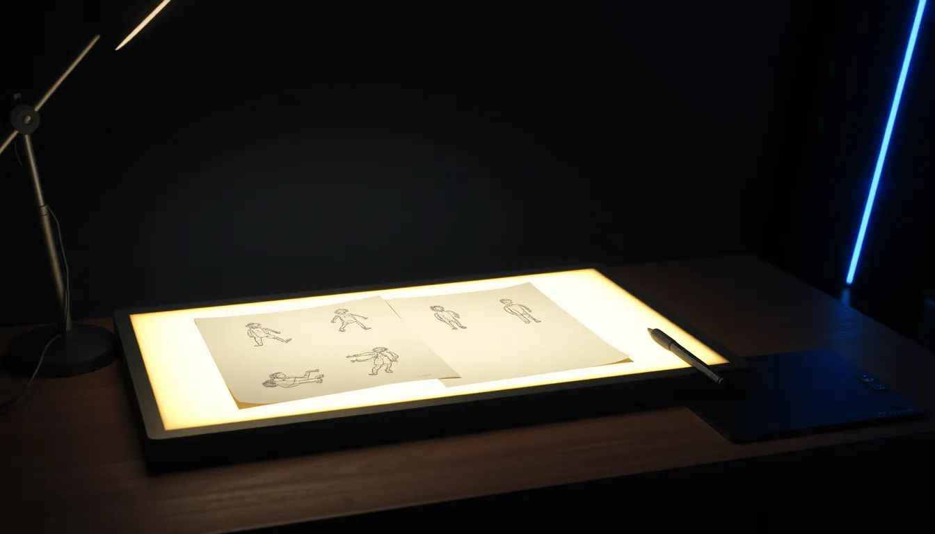
Hand-drawn animation, on a corporate project, is motion built from linework that keeps a person's hand visible, rather than smoothing every curve into vector-perfect geometry. A line meant to look drawn carries a small human variation from one frame to the next, and that variation is the entire point. Neither register is better on its own; each signals something different to whoever is watching.
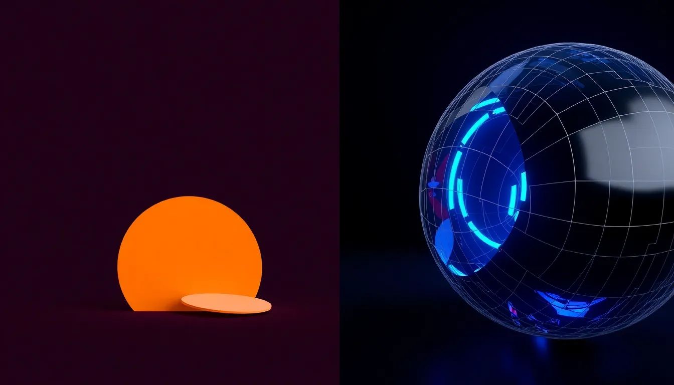
Polished vector work signals consistency, and it prices predictably because clean geometry repeats across scenes. Photoreal 3D carries a claim or a tolerance that has to be trusted at face value, which is its own kind of precision. Hand-drawn signals something else: that a person, not a system, decided how to say this.
The people who do this well decide those rules before a single frame moves: how thick the line stays, how far a curve may drift from true. A wobble that shows up once, in a chosen place, reads as character. The same wobble at a different width throughout reads like an unfinished draft, and that is the line between a style that lands and one that does not.
That governance answers to the brand underneath it. Motion graphics, 3D animation and VFX get used almost interchangeably in conversation, and mean different things once a quote is on the table. What each term actually means on a project breaks the three apart. Whatever the choice, line weight and roughness get locked before production starts, following the same reasoning behind choosing any animation style that fits a brand.
| Style | Signals | Where it fits | Cost direction |
|---|---|---|---|
| Hand-drawn | A person made this deliberately | Onboarding and human-first topics | Path-based work is lighter, frame-by-frame costs more |
| Polished vector | Consistency and corporate polish | Process explainers and brand rollouts | Prices predictably as geometry repeats |
| Photoreal 3D | Precision and evidentiary proof | Product launches and regulatory claims | Priced by what has to be built |
Why the sequence carries more of the message than the drawing does
A hand-drawn scene communicates through order as much as through linework. The eye can only absorb one new element at a time and connect it to what came before. Put everything on screen at once and the viewer does the sorting work the animation was supposed to do, which defeats the reason it was used at all.
Take a medical device manufacturer explaining how a diagnostic cartridge moves a sample to a result. The cartridge appears first, in outline. A drop enters the chamber next, and only then does a reader arrow appear, drawing its path toward a result panel that lights up last. Show it all in one beat instead, and the sequence meant to explain the device becomes decoration.
Where the style earns its keep
Hand-drawn animation earns its budget on a brief where the goal is to feel approachable before authoritative. Internal communications sit here often: a new process or safety step explained by something that looks drawn by a person, not issued by a legal team. Storytelling briefs sit here too, and so does any topic more human than technical. Choosing which explainer video style actually suits the message is worth settling alongside it.
A manufacturing group introducing a new reporting process to shop floor staff across several countries is a strong fit, since hand-drawn softens a compliance topic that would read as cold in flat vector graphics. A regional healthcare brand walking a nervous audience through a screening process fits for the same reason: a drawn line signals someone considered how the message would land.
Where it works against the message
The same style works against a brief where the audience checks for exactness rather than character. A precision engineering claim or a manufacturing tolerance needs to look as accurate as it is, asking the viewer to trust what they see at face value. A drawn line, however controlled, reminds the viewer that someone interpreted the object rather than showed it directly. On those briefs, weighing 3D animation against live action usually settles the format faster.
Regulatory and investor content sit in the same place. A pharmaceutical company demonstrating how a device functions, or a finance team walking a shareholder through a result, is asking to be believed on the facts. Warmth is not the job there. Precision is, and the visual style needs to match.
What the choice does to your budget and timeline conversation
Ask what kind of movement is being proposed before it gets priced, since hand-drawn work does not cost the same to produce. Some of it is path-based, a line drawing itself or an object riding a fixed route, which tools like After Effects build and reveal efficiently. Some needs a gesture to look slightly different on nearly every frame, because the drawing itself keeps changing. That kind takes longer, and the quote and schedule move with it.
The useful question in a scoping conversation is which parts of a scene move along a path and which get redrawn, since that distinction explains most of the range in what two similar-looking hand-drawn films end up costing.
What to look for when the first cut comes back
A first cut is the place to test whether the imperfection is doing its job. The eye should land where it is meant to, and each drawing should appear at a moment that earns it, not all in the opening three seconds. The roughness should hold steady across the film, the same line weight and restraint in scene nine as in scene one. A style that drifts partway through usually means the rules were never written down.
Hand-drawn animation suits a narrower set of briefs than a polished vector explainer or a photoreal render. Inside that set, it can do something neither of the other two formats does as well: make a corporate film feel like a person stood behind it.
If a topic on your desk needs to feel like it was made by someone rather than assembled from a template, that instinct is worth trusting. Dustin Hill Productions builds hand-drawn work alongside 3D and live action, so a project gets the format its message needs. A conversation about animation for a corporate project is usually where that choice starts to take shape.
Frequently Asked Questions
What is hand-drawn animation in a corporate video?
Hand-drawn animation is a style where the linework carries visible, controlled human variation instead of being smoothed into perfect vector geometry. On a corporate project it makes a topic feel approachable, as though a person made it, and it works best when the roughness follows a fixed set of rules rather than happening by accident.
How does hand-drawn animation actually work?
Artwork gets built as separate elements rather than one flat drawing, so each part can move or reveal on its own. Some elements are revealed along a path, closest to a line drawing itself on screen. Others, especially a gesture or a face, need to be redrawn slightly differently across a run of frames as the shape changes. A finished sequence times these so one element appears at a time.
Does hand-drawn animation cost more than standard motion graphics?
It depends on what kind of movement the brief needs. Simple path-based reveals sit close to standard motion graphics pricing. Expressive frame-by-frame work, where a drawing changes on nearly every frame, takes longer to produce, and the quote reflects that. Ask a studio which parts of a proposed film fall into each category before assuming either direction.
Will hand-drawn animation look unprofessional for an MNC audience?
Hand-drawn animation looks unprofessional only when the roughness is left to chance instead of governed by rules. A consistent line weight and a style that matches the brand from first scene to last separate a hand-drawn film that reads as considered from one that reads as unfinished. Reviewing a style frame before the full build starts confirms the rules are locked.